
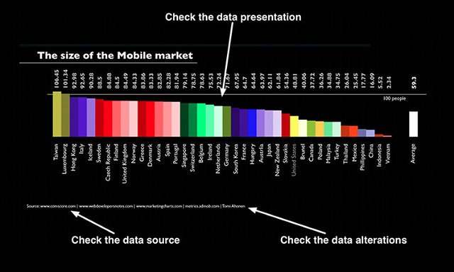
This excellent article by Randy Olson discusses the different ways infographics are often manipulated to skew the reader's perception. The main 3 methods include:
1. Using visual cues such as color or shape to make a part of the design stand out that numerically might not be noticeable.
2. Using unreliable or biased data sources upon which the visual is based.
3. Excluding, transforming, or manipulating the data itself to create a narrower picture.
Check out the full article here:
Infographics Lie. Here's How To Spot The B.S.
No comments:
Post a Comment